90s Packaging Design and Staying Ahead of the Curve
June 03, 2025

Just like fashion, hairstyles and music, packaging design trends come and go. With the 90s making a(nother) comeback, let’s take a walk down memory lane and look at product packaging design trends in the 1990s and how 90s product packaging compares to packaging today. In this article you’ll learn how to stay ahead of the curve by understanding what drives changes in packaging design over time, from functional needs to pop culture.
Packaging Design Trends and Pop Culture in the 90’s
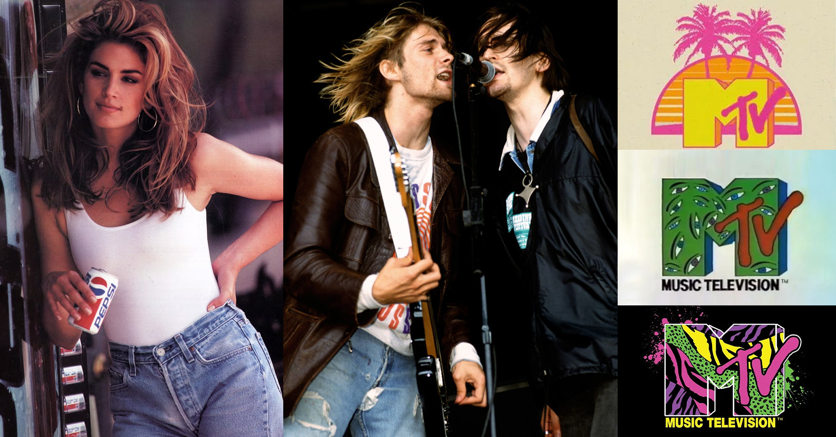
The last decade of the last century was an exciting time. Pop culture of the 90s saw the rise of grunge music with alternative rock and hip hop also taking center stage. Iconic TV shows like Seinfeld and Friends ruled the airwaves. A new breed of movie rose to popularity too, with independent films like Quentin Tarantino’s Pulp Fiction taking theatres by storm alongside traditional blockbusters like Titanic and Jurassic Park. The fashion world said goodbye to over-the-top 80s style and ushered in a sleeker, more simplistic way of dressing that still influences designers today.
In the world of packaging design trends, the 90s also reflected a shift away from the neon colors and futuristic designs that defined the 80s aesthetic. Brands started using bolder color palettes and typefaces and evolved their identities to keep up with the the beginning of the digital era.
10 Packaging Design Examples from the 1990s (Compared to Today)
Let’s look at some 90s packaging design examples and see how they stack up against their contemporary counterparts.
- KitKat Bars
- FedEx
- Cool Ranch Doritos
- Kellogg’s Cereal
- Soda Bottles
- Apple Computers
- Lunchables
- Amazon
- Starbucks
- Nokia Mobile Phones
1. KitKat Bar


While the KitKat recipe may not have changed since the 90s, the packaging has. These crispy wafers covered in milk chocolate used to come wrapped in foil with an outer paper layer showing the logo. However, they recently replaced that design with a single layer of plastic packaging which the manufacturer (Hershey’s in the US, Nestlé elsewhere in the world) says is more environmentally friendly.
2. FedEx
After launching the world’s first overnight delivery service in 1972 under the name Federal Express, the company adapted its purple, red and white logo in 1991, shortening the name to FedEx and updating its color palette to a darker purple and orange in keeping with the aesthetic of the time. Following another rebrand, FedEx adopted the current logo which features a cleaner font, softer colors and, most notably, the inclusion of an arrow hidden between the capital E and x symbolizing what the brand does: getting stuff from here to there. This is an example of packaging design that evolved with the brand.
3. Cool Ranch Doritos
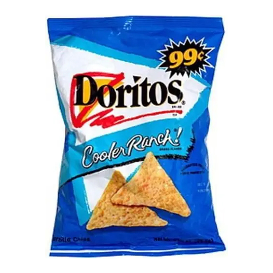
Back in the 90s, Doritos came in a plastic bag with a bowl-shaped window to help you imagine chipping and dipping with these tasty treats. The design featured bright, bold colors including the signature orange and yellow logo. As packaging design trends moved away from the more garish 80s style, Doritos updated their packaging too, evolving the logo to include a triangle, while keeping the corn-chip-themed colors. Today, the packaging uses more muted colors and a sleek, modern logo, still featuring the triangle in orange and yellow.
4. Kellogg’s Cereal
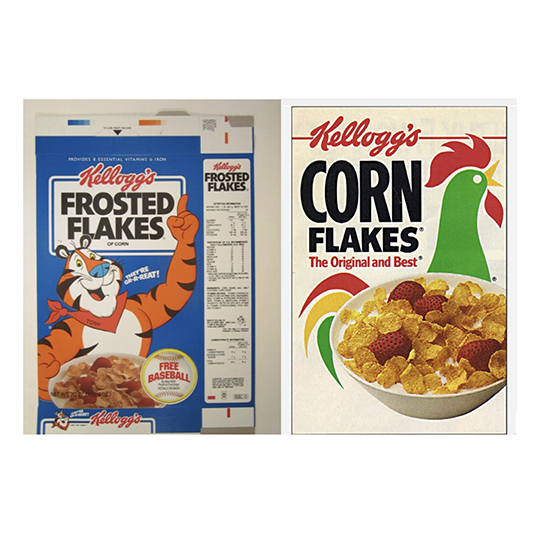
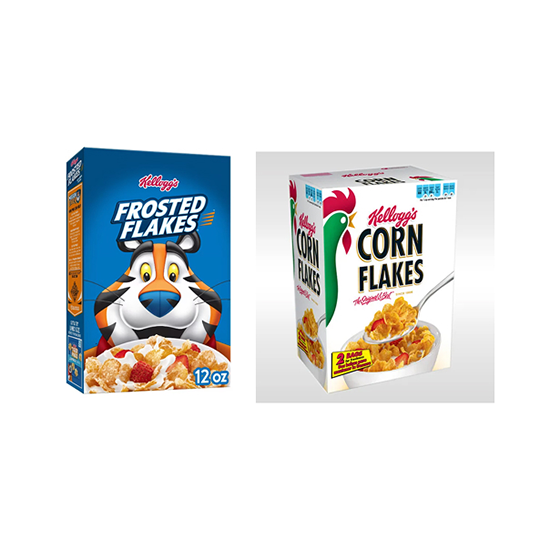
Kellogg’s cereal has some of our most recognizable breakfast table packaging, with iconic images like Tony the Tiger and the Corn Flakes rooster. While the mascots themselves have stood the test of time, the packaging designs have evolved in subtle but significant ways to keep pace with changing aesthetics. Tony the Tiger is more three-dimensional today than he was in the 90s, as is the rooster, and the color palette for both products has deepened slightly, while staying true to their original aesthetics.
Understanding the power of nostalgia, Kellogg’s Canada launched a retro marketing campaign in 2023, putting iconic cereal box designs from the 70s, 80s and 90s back on the shelves for a limited time.

5. Soda Bottles

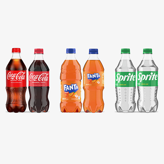
Eco-friendly packaging is much more prominent than it was in the 90s, with many businesses moving away from single-use plastics, Styrofoam and other non-biodegradable materials. One example is the soda bottle. Back in the day, soda was still sold in glass bottles with Styrofoam labels which offered a layer of protection, felt good to hold and were extremely satisfying to peel off. (If you know, you know). These days, most beverage companies have adopted more sustainable packaging. For example, Coca-Cola recently debuted new lightweight PET bottles that use less raw material as part of an ongoing commitment to reducing waste and emissions.
6. Apple Computers

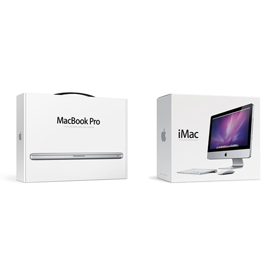
Technology has come a long way since the 90s, and so has its packaging. Take Apple, for example. By the mid-90s, Apple computers were making a breakthrough in the personal computer market. These computers (both desktops and laptops) were a lot bigger and bulkier than today’s models, so naturally, the packaging was also bigger and bulkier. While 90s Apple packaging features the signature logo the company still uses today, it has none of the slick, minimalist design they’re now famous for. The first inklings of this new aesthetic can be seen in the packaging design for the first iMac computers, launched in 1997.

7. Lunchables
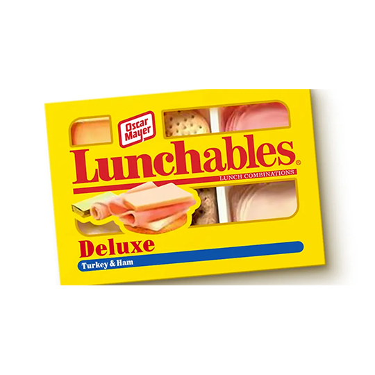
Oscar Mayer launched Lunchables nationally in 1989, and the grab-and-go snack pack quickly became a lunchbox staple for kids in the 90s. The original Lunchables contained meat, cheese and crackers. (Fun fact: Lunchables were actually created to use up excess bologna, which had fallen out of popularity by the 80s.) The original packaging reflected this simplicity, with a plastic container featuring a basic red and yellow design and windows to show the contents. Today, Lunchables come in a wide range of offerings, from pizza meal-kits to sub sandwiches and nachos. The packaging has also been given a modern makeover, with a refreshed logo, vibrant colors and imagery, and nutritional information printed on the front.
8. Amazon
Amazon dominates the eCommerce industry in the US today. But back in 1995, it was just starting out as an online bookstore, with the original logo depicting the river the company was named after inside the shape of a capital A. The company evolved rapidly and significantly throughout the rest of the decade, expanding to sell music and videos in 1998 before opening its virtual doors to third-party sellers in 2000. The company’s logo also changed, undergoing multiple changes as the brand evolved, eventually settling on the current logo. Like FedEx, the current Amazon logo includes an arrow signifying what they do; in this case, selling everything from A to Z.
9. Starbucks
As the brand that changed the way America drinks coffee, Starbucks has one of the most recognizable logos in the country, if not the world. But that logo has also evolved significantly over time. In 1987, the Seattle-based powerhouse first adopted their signature green, replacing the original brown and black logo. In 1992, it changed again to a more close-up (and more modest) portrait of the siren. In 2025, the Starbucks logo is even simpler, featuring just the close-up siren portrait in Starbucks’ signature green and white. The evolution of Starbucks packaging design mirrors the brand’s rise to become a global icon.
10. Nokia Mobile Phones
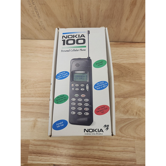
Mobile phones were still a bit of a novelty in the early 90s. They were big, expensive, and only made calls. Mobile phone packaging had to be big enough to protect the technology inside, and also do a good job of telling potential customers what it was and what it was capable of doing. Over the course of the decade, mobile phone technology advanced by leaps and bounds, with phones becoming smaller and more affordable, and the first camera phones coming out in 1999.
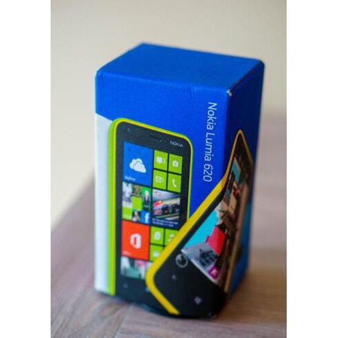
Today, pretty much everyone has a smartphone that’s compact, powerful and does a lot more than make calls. Mobile phone packaging has also evolved, with many brands opting for sleek, minimalist designs. While contemporary smartphone packaging will tell you what model it contains and include some brief specs, it’s primarily geared towards creating a sense of luxury and a memorable brand experience.
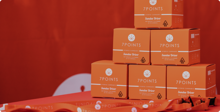
How Ernest Can Help You Reinvent Your Packaging Design
Ernest has been designing innovative, ground-breaking packaging solutions since long before the 90s. Whether you’re in the market for an eco-friendly design, need packaging that pops on the shelf or are looking to solve a unique supply chain or production challenge, we’ve got the experience and the expertise to find the perfect retail packaging solution for your needs. And if you’re looking to revive the 90s, our team of design experts can bring that retro flair, too.
Let’s talk about how we can help your brand stay ahead of the curve with packaging solutions that stand the test of time.