Accessible Packaging Design: The Importance of Inclusivity in Packaging
May 04, 2026
Accessibility has become a hot topic in recent years, with regulations requiring websites to cater all users, including those with disabilities, just like public spaces have been required to do since the Americans with Disabilities Act (ADA) was enacted back in 1990. But have you ever given much thought to accessibility when it comes to packaging? In this article, you’ll learn why accessible packaging is important and discover smart ways to make inclusive features a priority in your packaging design process.
What is Accessible Packaging?
Let’s start with the basics. Accessible packaging refers to product packaging that’s designed to be easy for anyone to safely and effectively use, open and hold, no matter their physical, sensory or cognitive abilities. That means making opening features safe and simple, regardless of any motor or physical impairments, and ensuring product information can be understood by the visually impaired, too. Literacy challenges are another key consideration.
Also known as inclusive packaging, accessible packaging serves all consumers, so that no one is discriminated against, helping to create a more satisfying, positive customer experience overall. Plus, designing packaging that’s accessible and inclusive is the right thing to do.

The Need for Accessible Packaging
Many packaging designs require two hands and considerable force to open. This may be challenging for people with motor impairments, who often resort to using their teeth instead. By opting for opening features that eliminate “the teeth factor,” meaning they can be easily opened using just one hand, you’re making the design inclusive and accessible. This also makes life easier for older people, who are more likely to have arthritis and other dexterity-related issues.
We often talk about the importance of shelf appeal in packaging design, because you need to catch the eye of busy shoppers as they pass. But what about the visually impaired, or those who may not be able to read? The need to make product information accessible is equally important, so all shoppers can make informed choices about what they’re buying. Including tactile elements for the visually impaired and clear images for those with literacy challenges can make product information more accessible.
With over 70 million U.S. adults reporting a disability of some kind, it’s important to prioritize accessibility and inclusivity in your packaging design process. Not only does this allow you to tap into the sizable market of disabled individuals and households, it’s a good way to ensure no one has an unfavorable experience with your packaging, which can reflect badly on your brand.
Important Features of Accessible Packaging
Next, let’s look at some of the key components and features that can help disabled consumers overcome common challenges. Incorporating these features into your packaging design will ensure that it’s accessible and inclusive.
Tactile Features
For the visually impaired, the sense of touch is key. Adding tactile elements to your packaging will help them understand what they’re buying, so they can shop independently and safely. This can include embossing, raised symbols and a variety of surface textures. Raised lettering and logos can also make it easy for the visually impaired to identify your brand on the shelf.
Braille labels are the best way to clearly communicate important product information and safety details. But you can also distinguish products in more subtle ways. Consider adding raised lines, patterns or symbols as identifiers. Herbal Essence puts raised vertical lines on its shampoo bottles and raised circles on conditioner so consumers can tell the difference between the two, both in the store and in the shower.
Visual Clarity
Make sure your packaging is readable by incorporating clear visual elements, such as large, clear fonts and typography, and high contrast design, pairing text and background colors for optimal visibility. Black on white or vice versa offers the clearest contrast, making it easier for those with reduced sight to see and read.
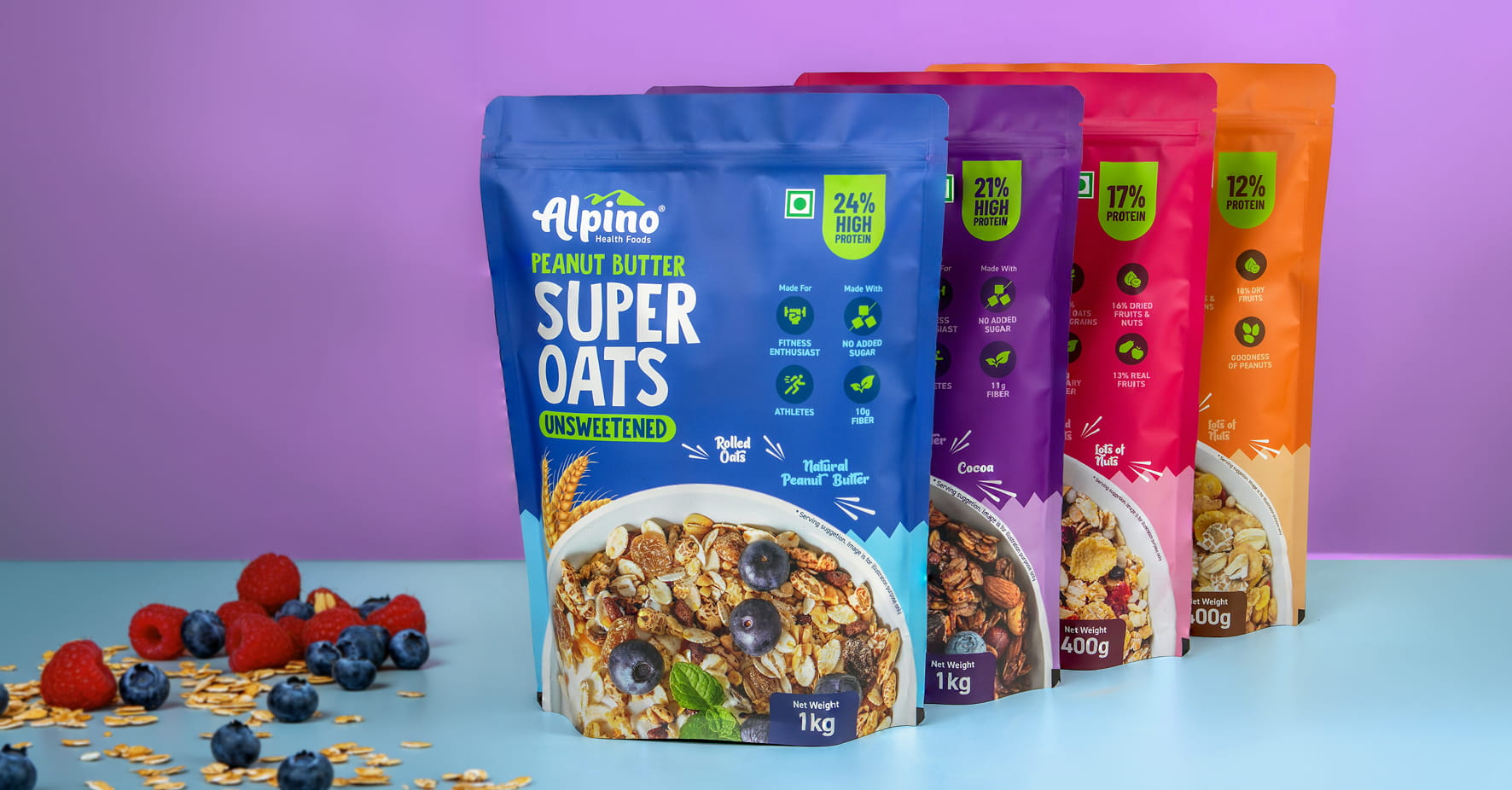
Color coding is often used to convey important food safety information, such as red for raw meat, white for dairy and blue for raw fish. But it shouldn’t be solely relied on. To ensure inclusivity, combine color coding with other clear visual or tactile elements like symbols, patterns or text (raised or high-contrast).
Ease of Use
It’s important to think about how to make sure consumers with physical disabilities or motor skill challenges, including older folks, will be able to hold, handle and open your packaging. Textured surfaces and indentations can make packaging easier to grip, as does balancing package size and weight.
Easy-open features and mechanisms are critical, and shouldn’t require a lot of strength or dexterity. One-handed opening is optimal. Incorporating a wide, stable base can help by ensuring the package doesn’t tip over when you’re opening it—especially with one hand.
Auditory Indicators
For consumers with hearing impairments, auditory indicators can make product information easily accessible. The most common features provide auditory feedback that convey specific information, such as clicking or snapping closures to indicate when the packaging is closed properly.
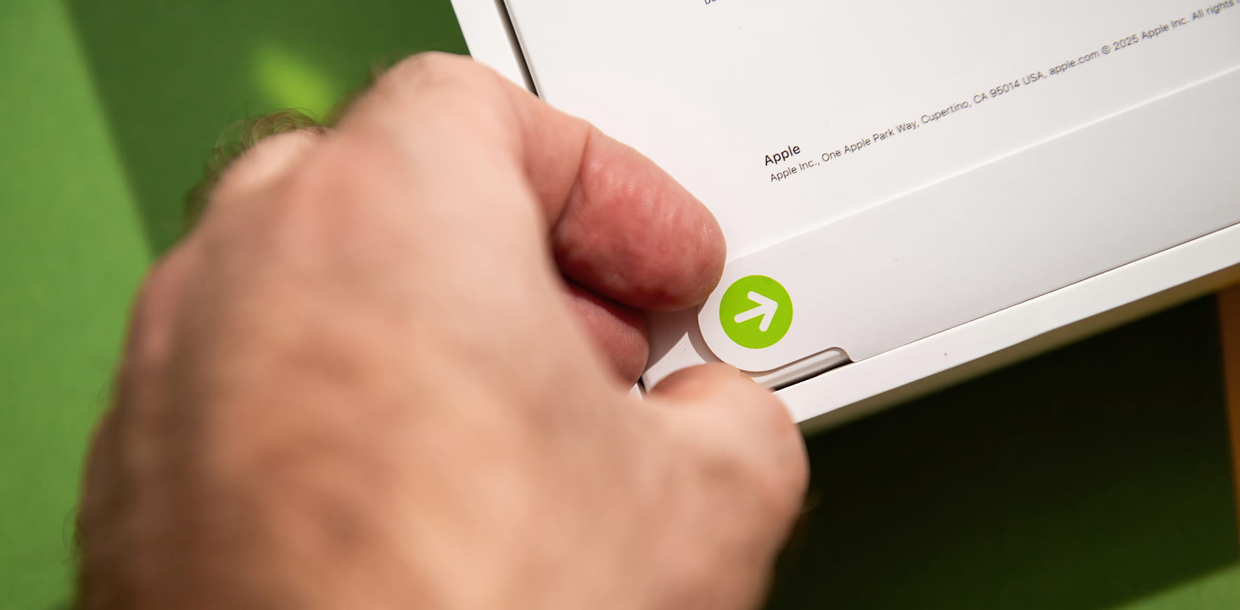
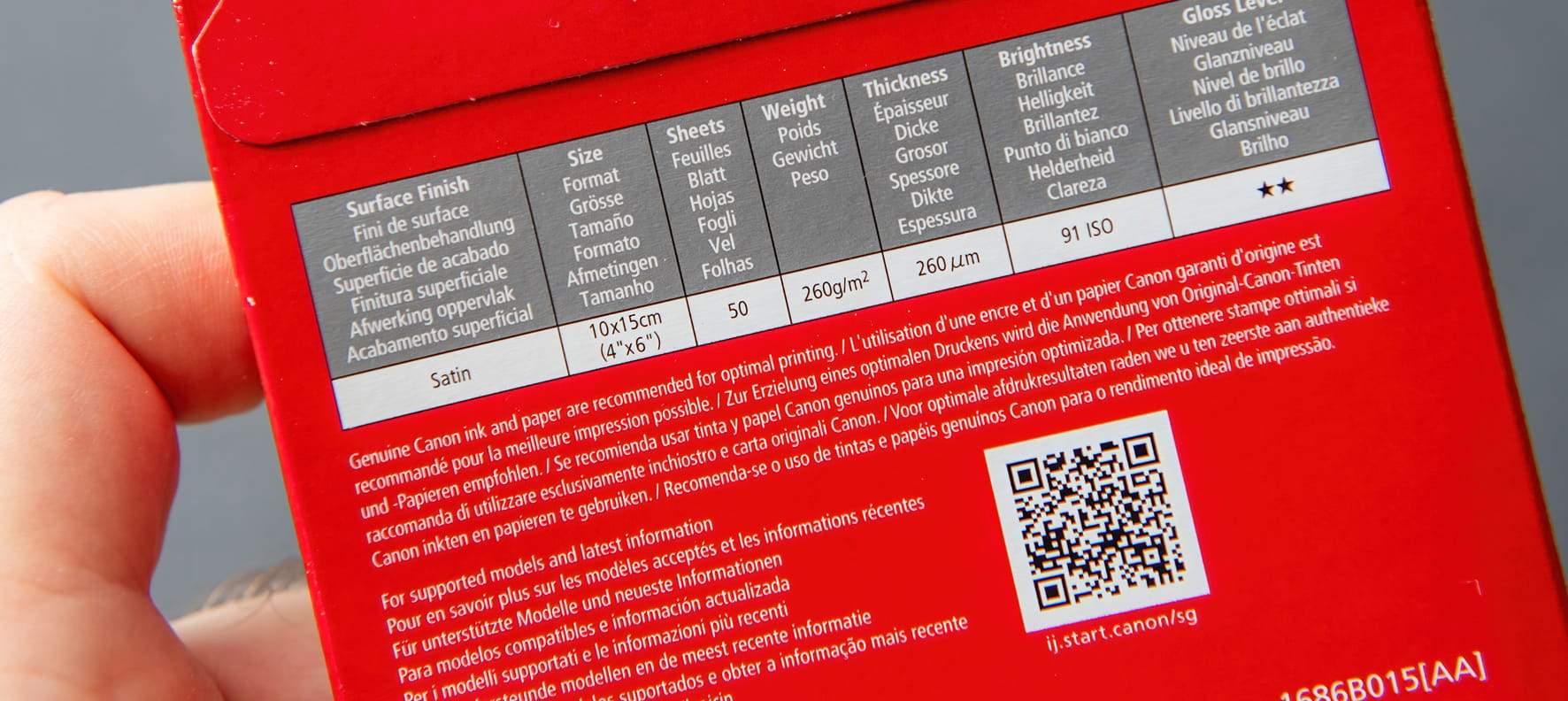
On the more technical side, brands may integrate smartphone technology into the packaging picture by including QR or NFC codes which users can scan to access audible product info and instructions. Some apps even offer sign language translation. In the future, we may be able to embed voice tech directly into product packaging, but we’re not quite there yet.
Technology Enhancements
Smart packaging features, such as the QR and NFC codes mentioned above, can enhance accessibility for other groups, too. In addition to providing audio information, QR codes can link to translated content, video instructions or high contrast visuals. You can even offer hands-free accessibility by offering voice-activated packaging, or linking to an app that’s designed for inclusivity.
Accessible Packaging Examples
Some of the world’s leading brands are leading the way in accessible and inclusive packaging design. Check out these real-world examples.
Kellogg’s
To support blind and visually impaired shoppers, Kellogg’s rolled out cereal boxes with NaviLens technology—a world first. Shoppers simply point their smartphone in the direction of the cereal box and it detects the unique code to unlock information from the label via smart read playback technology. This helps shoppers identify the right cereal and access important nutritional information, without asking for help.
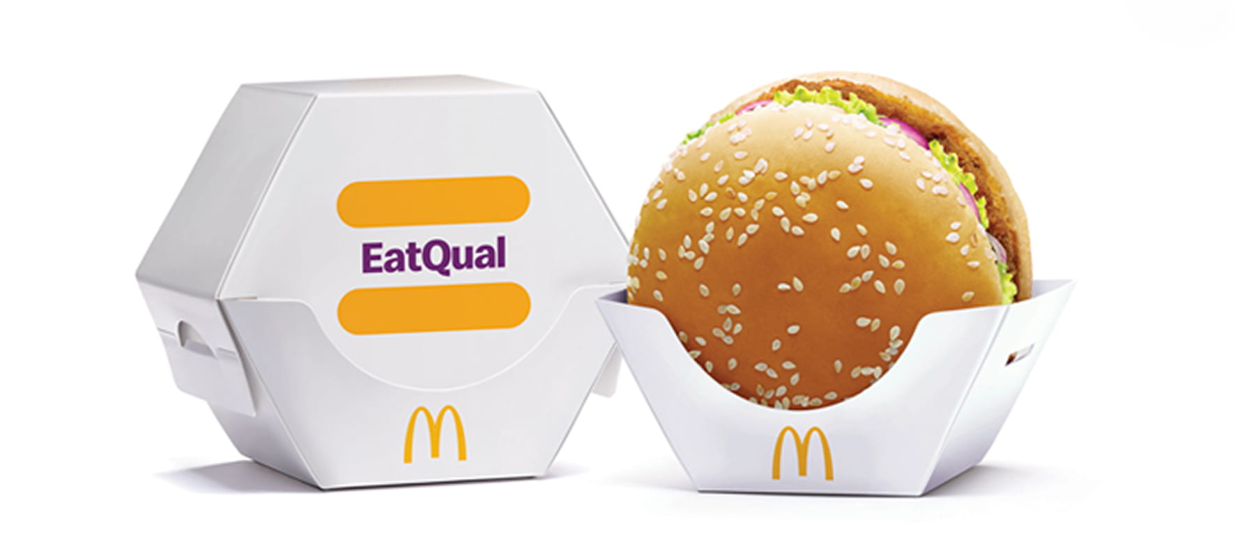
McDonald’s
Eating a burger with two hands is something most of us take for granted. But for the millions of people living with limited upper limb mobility, this simple act can be a serious challenge. In India, some branches of McDonald’s offer a choice of burger packaging that’s designed for one-handed opening and eating. This simple step allows people with mobility issues to eat their burger with dignity.
Degree
Putting on deodorant in the morning is another thing many of us take for granted, but it’s something many people with disabilities have to ask for help with every day. To empower people with physical and visual impairments, Degree created an inclusive deodorant that’s designed for easier opening, handling and use. The packaging features an easy-grip shape with a looped lid and magnetic closure, making it easy to use with one hand. Plus, the roll-on applicator covers more skin with each swipe. Braille instructions round out this well thought out design.
Accessibility Packaging Guidelines and Standards
The ADA Standards for Accessible Design require all newly constructed public buildings and facilities to meet stringent requirements that make them accessible to people with disabilities. As of yet, there’s no specific ADA requirement for packaging. But the general guidelines can also be applied to packaging design, which means focusing on the key goals of equal usability, meeting diverse physical, cognitive and sensory needs, and benefiting all users, regardless of ability.
The International Organization for Standardization (ISO), which sets internationally agreed upon standards and provides globally recognized guidelines for processes, products and services, has put out a document addressing accessible packaging design, handling and manipulation.
Microsoft has also put out a comprehensive guide to inclusive packaging design, with recommendations and practical tips for incorporating accessibility into the process at every step. Although it’s not a regulation, it’s a great resource for anyone looking to make sure their packaging is safe, easy and effective to use for consumers of all ages and abilities.
5 Accessible Packaging Design Strategies
Now let’s talk about how you can make accessibility a priority in your packaging design process. Not only will this help you cater to a wider group of consumers, it can give you a competitive advantage by showing people that you care.
1. Make Inclusivity a Core Principle of Packaging Design
Whenever you approach a new packaging design, keep inclusivity top of mind. Don’t just think about how you would handle, carry and open the packaging, consider how people with various disabilities will manage it, too. By making inclusivity a core principle, you can avoid features and functions that make packaging difficult for some people to use, handle or open.
2. Conduct User Research with Diverse Populations
When approaching your packaging design, make sure your research includes diverse populations, such as people with physical, cognitive or sensory disabilities. If you only gather information from able-bodied consumers, you may inadvertently exclude some populations from being able to use your package easily and effectively. Ask all users what challenges they face with packaging and how you can alleviate difficulties.
3. Collaborate with Accessibility Experts
If you’re not sure where to start, call in reinforcements. Non-profit organizations are a good place to find accessibility experts who can share proven insights to inform your process. The Arthritis Foundation in particular is focused on testing products for ease of use by people with hand impairments. You could also source specialized consultancies who work with disabilities, or turn to major companies which often have internal teams tasked with ADA compliance.
4. Adhere to Universal Design Principles
Anything you’re designing, creating or building, from a bridge to a box, should be usable by anyone, regardless of ability. Developed by the Center for Universal Design at NC State, the Universal Design Principles encompass seven guidelines for creating products and environments usable by all people, to the greatest extent possible, without adaptation. These seven principles focus on:
- Equitable use
- Flexibility in use
- Simple and intuitive use
- Perceptible information
- Tolerance for error
- Low physical effort
- Size and space for approach and use
5. Conduct Iterative Testing and Feedback
Once you’ve come up with a design that you think is inclusive and accessible, test it with as many consumers as possible, including people with a range of disabilities. Get their feedback, find out what’s working and where you can improve. Adjust. Iterate. Repeat.
Degree invited 200 consumers with varying physical disabilities to test their Inclusive Deodorant prototype before going to market, collecting and applying their feedback to land on a unique design that’s truly accessible and inclusive.

Partner with Ernest for Accessibility-Focused Packaging Design
If you’re interested in making accessibility a core feature of your product packaging, Ernest can help. We’ve got boxloads of experience with custom packaging design and production for clients of all shapes, sizes, and industries.
From easy-open features and disability friendly grips to tactile labeling and QR codes, we’ve got you covered—along with all your customers, regardless of ability. Drop us a line so we can start the conversation about inclusive packaging for your brand and needs.